Tech City startup Geckoboard have long been best in class for creating data dashboards and displays for companies and organisations of all sizes. We caught up with their VP of Marketing, Simon Whittick, to hear some insights on data-driven marketing.
As marketing and growth teams there is more and more data available to us, and we’ve been bombarded with the horrible term “big data” (at Geckoboard we strongly dislike that term, which is what motivated us to create out Big Data Buzzword Bingo game). This avalanche of available data makes it difficult to know where to start when it comes to making the data useful. It’s also a challenge to ingrain this data within the culture of your team, so that they make decisions based on data.
I believe that there are four simple steps every marketing and growth team should take to make their data useful, meaningful and digestible to ultimately build a strong data-driven culture.
1) Start with your business’s KPIs
Often forgotten, KPIs are your most critical business metrics. They are the best tool to bring focus to your data strategy, and ultimately build a data-driven culture throughout a business. If your business hasn’t already set KPIs that match back to the business strategy and objectives then I’d recommend reading Lean Analytics and get this process started.
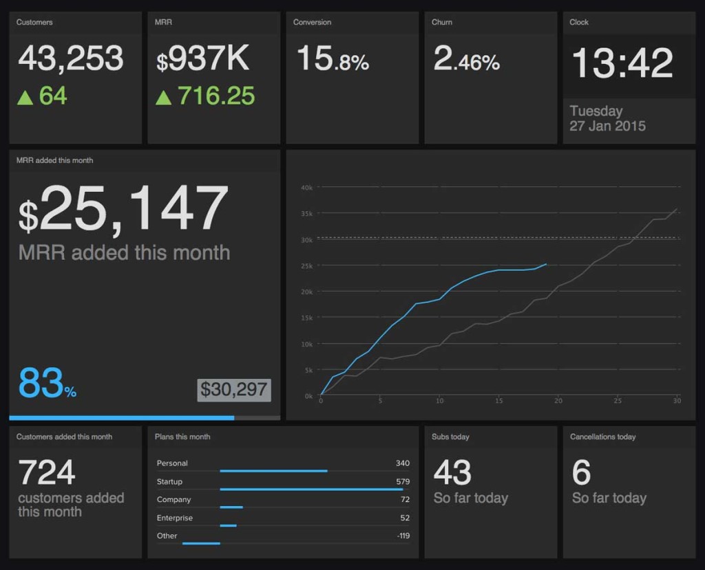
To give you an example, here at Geckoboard some of the business KPIs we focus on are:
- Customer Numbers
- Monthly Recurring Revenue (MRR)
- Conversion Rate from trial to paying customer
- Churn Rate
- Customers Added
- Trials Started
These probably won’t all be the right metrics for your business. However, they should give you the types of KPIs you should focus on to understand and optimise your business.
2) Waterfall those KPIs into your marketing and growth team
Now it’s time to match those business KPIs back to your marketing and growth strategy to define what you’re going to measure. Think of these as your marketing KPIs. When we went through this process, we sat with a bunch of post-it notes, wrote metrics on them and then put them in the middle of the table to discuss what was relevant and what wasn’t. This meant we could then put those post-its on a screen to define our Geckoboard layout before we started building it.
Anyway, our marketing strategy is focused on content marketing. We’re big fans of Hubspot’s work and I recommend you read their book and subscribe to their blog if you want to find out more about that. This focus means that our marketing metrics break into key areas of a) content, b) reach, and c) conversion or value. The metrics we believe are most useful for these topics include the below.
A) Content:
- Bounce rate
- Average session time on the blog
- Most read blogs
- Newsletter open and click rates
- Trial email open and click rates
B) Reach:
- Website visitor numbers and trend
- Organic rankings for a target keyword list
- Inbound link volumes
- Follower and like numbers on Facebook, Twitter and LinkedIn
- Social share volumes
- Newsletter subscriber numbers
C) Conversion / Value:
- Top converting referral sources
- Website visit to trial, newsletter and demo conversion
- Average revenue per new user
Some may sound like vanity metrics, but they’re not. Instead they’re largely an indicator of our reach, which as it increases drives trials, which ultimately feeds into all our top-level business KPIs.
3) Visualise the data in a digestible way
Many data visualisations are not designed for how the human brain digests data. CEO Paul Joyce describes the challenges and the need for data to be communicable to humans well in these two articles:
It’s also worth reading Information Dashboard Design if you have time. There are a few major mistakes made when visualising data for the human mind:
- Trying to make visualisations beautiful, not digestible
- Too much colour, which means the human brain can’t use the colour to process the data
- Overusing different fonts, font sizes and movements, creating too much distraction
Ultimately, you need to go back-to-basics using colours, fonts and font sizes sparingly.
4) Make the data visible
The adage “what gets measured gets done” is so true. However, it’s even more likely to be true when what gets measured gets shared. Too often data isn’t shared, which means it doesn’t get done. This is because team members can’t see how they’re tracking against their KPIs. When your marketing and growth team can see the performance data, they can react to positive and negative fluctuations quickly and become more data-driven.
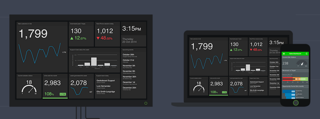
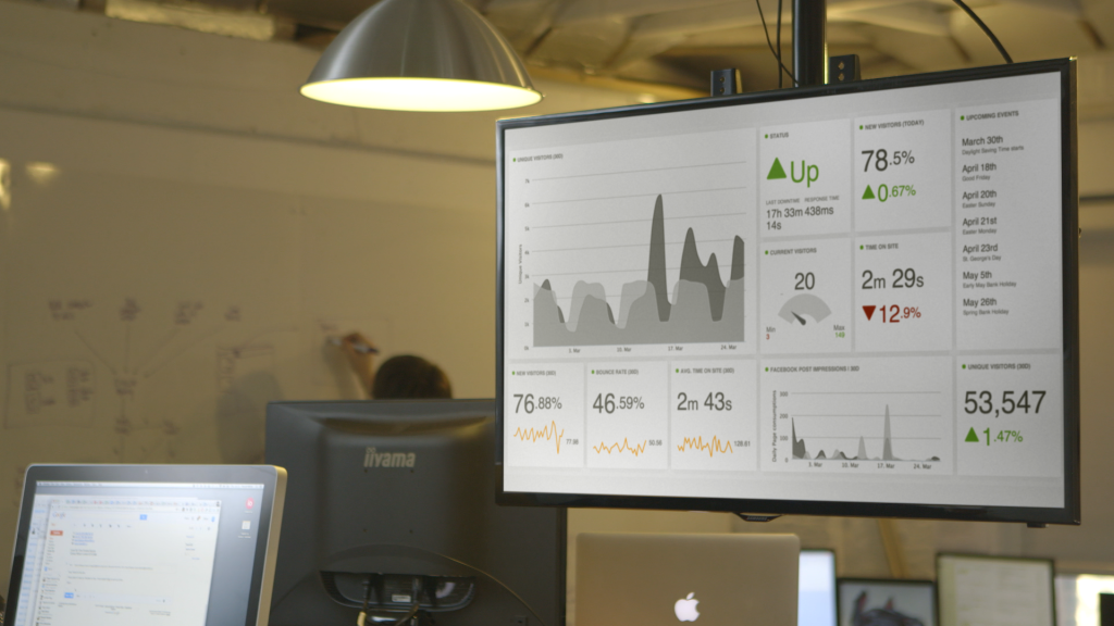
That’s why we designed Geckoboards for the big screen, because we believe that having all your most useful business data on a TV in the office can transform cultures. It’s really surprising how a screen with data on becomes an office watercooler as team members stand and discuss the data, which sparks ideas.
I hope that’s given you a few simple steps to break your marketing and growth data down and make it useful. Please let us know how you get on building a data-driven culture in your team. Try Geckoboard today.


